office@waldbach.nl • +31 6 81377157

At Studio Waldbach, we have a passion for boosting your brand’s online and offline visibility. With over 20 years of experience in visual identity design, print design, web development, and more, we are dedicated to propelling your brand to new levels of success.

Visual identity, branding & implementation ARTICULATE, EXPRESS AND CULTIVATE

We use our vast experience — over 20 years! — and original, bespoke design approaches to create impressive visual personas that encapsulate our clients’ unique values and distinctiveness.

We’re in the business of creating bold and striking visuals that grab attention and inspire connections, driving our clients’ growth and success to new heights. Our commitment lies in delivering design excellence that transcends trends and stands the test of time.

Online presence without compromise SEAMLESS BRAND EXPERIENCE ACROSS MEDIA

At Studio Waldbach, we don’t just create websites; we craft online brand experiences. We empower your online presence with the latest web standards, tools, and security strategies. Our web design and development solutions aren’t just strikingly stylish and user-friendly; they’re SEO-optimized powerhouses for topping the rankings. Because we believe good design isn’t just aesthetic—it’s also about best-in-class technology and performance.

Who is Waldbach? SOLOPRENEUR & TEAMPLAYER

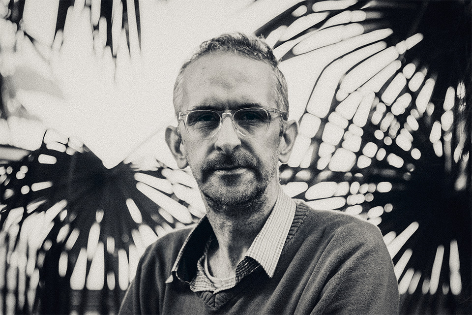
As a dynamic creative force, Janne Wolterbeek (born 1976, Middelburg) brings his multifaceted design talents to life at Studio Waldbach. While he mostly flies solo, he’s ever enthusiastic to join forces with experts across a breadth of disciplines, both near and distant. In this light, he refers to Studio Waldbach in plural, echoing the harmonious symphony of collaboration.

When he collaboratively weaves ideas with skilled and enthusiastic coders, attentive printing professionals, and a diverse array of other gifted individuals, that’s when a subtle glimmer of ingenuity subtly appears. We must also modestly mention – our client relationships! They are indeed a dynamic and engaging play of teamwork, and that is something we deeply cherish.
A modest selection of our output embark on a visual journey

Don’t just listen to the talk, see the walk! Our collection of work clearly reveals our knack for creating engaging visuals, shaping digital spaces, and spinning effective codes.

Hop in, we’ve got an open door for discovery.

Sustainable investments JGM CAPITAL, AMSTERDAM

In the year 2021, the brilliant Marcel Versteeg brought his visionary ideas to life and created JGM Capital – a remarkable investment firm that is completely devoted to the world of real estate developments.

At the heart of their mission lies an unwavering determination to achieve sustainability goals. They do this by investing in the strategic design, construction, and long-lasting lifespan of real estate projects. Their level of creativity and expertise knows no bounds, as they excel in meeting the sophisticated demands of the luxury tourism industry on a global scale.

With passion and an enthusiastic approach, JGM Capital is reshaping the landscape of real estate and leaving an indelible mark on the world.

JGM’s wordmark font’s quirky characteristics are a direct reference to the Grotesques of late 19th and early 20th century, a gentle nod to JGM’s stately first office building in Amsterdam Zuid, a stone’s throw away from the famed Museumplein.

JGM Capital’s primary hue of their visual persona, the profound black, embodies their reputable and rigorously solid approach towards investment strategies. This ingenious blend of opulence and refinement, subtly hints at the luxury and sophistication that form the cornerstone of JGM Capital’s corporate personality.
Click on the above image to view more examples of our output.
Click on the above image to view more examples of our output.

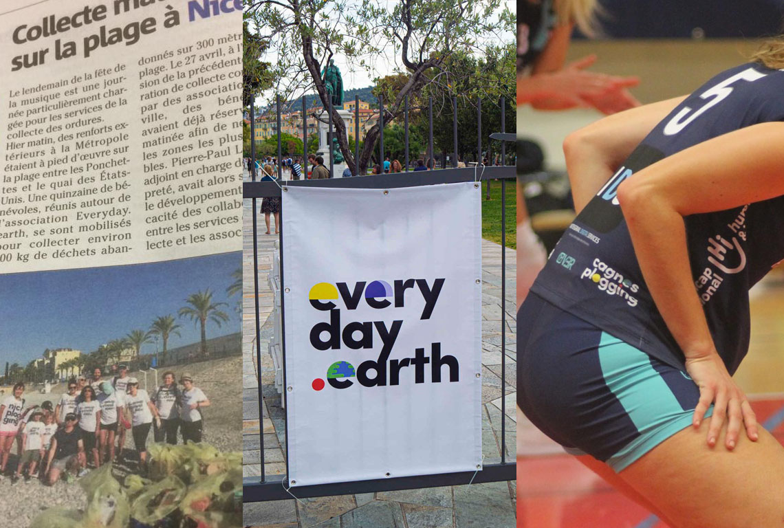
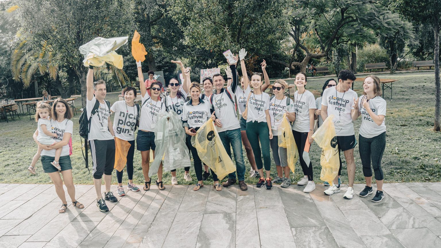
The kind and generous actions of the Everyday Earth participants spread far and wide. They caught the attention of Christian Estrosi, the respected Mayor of Nice, and his accomplished spouse, Laura Tenoudji. Laura is a renowned news correspondent at France 2, a French public broadcast station. Together, they decided to join a fun Plogging event in the center of Nice on World Cleanup Day, a global celebration.

Everyday Earth’s carefully planned events caught the attention of both local and national press in France. Their remarkable efforts were even acknowledged with a formal commendation from the national Assemblée Générale.

In 2022, Everyday Earth went through a major transformation and emerged as Agirrr, a fresh and exciting new version. Leading this incredible change was none other than the brilliant Thierry Lebrun. With his innovative ideas, Lebrun guided the organization to promote local plogging activities in various towns along the beautiful Cote d’Azur and even beyond. Agirrr’s plogging events have transformed the landscapes in various municipalities like Nice, Cagnes, Cannes, and Lyon.

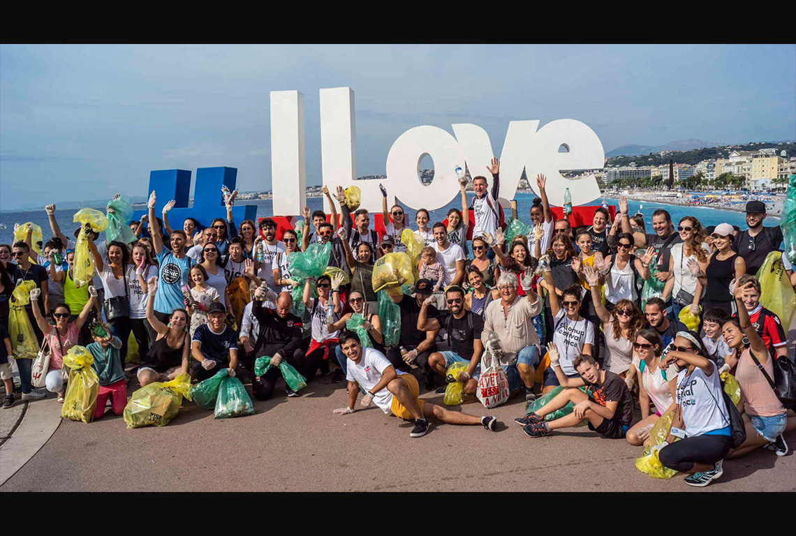
Every day is Earth Day Everyday Earth / Agirrr

Everyday Earth came to life in 2018, thanks to the brilliant minds of Bela Hatvany and Wim Kiezenberg. Bela, a seasoned software engineer, and Wim, a marketing savant and design maestro, joined forces with a common goal – to make our Mother Earth healthier and more harmonious. Everyday Earth is not just a platform, it’s a place where conversations come to life. They’re passionate about discussing important topics like waste pollution and social inequality because they believe in creating change together. 

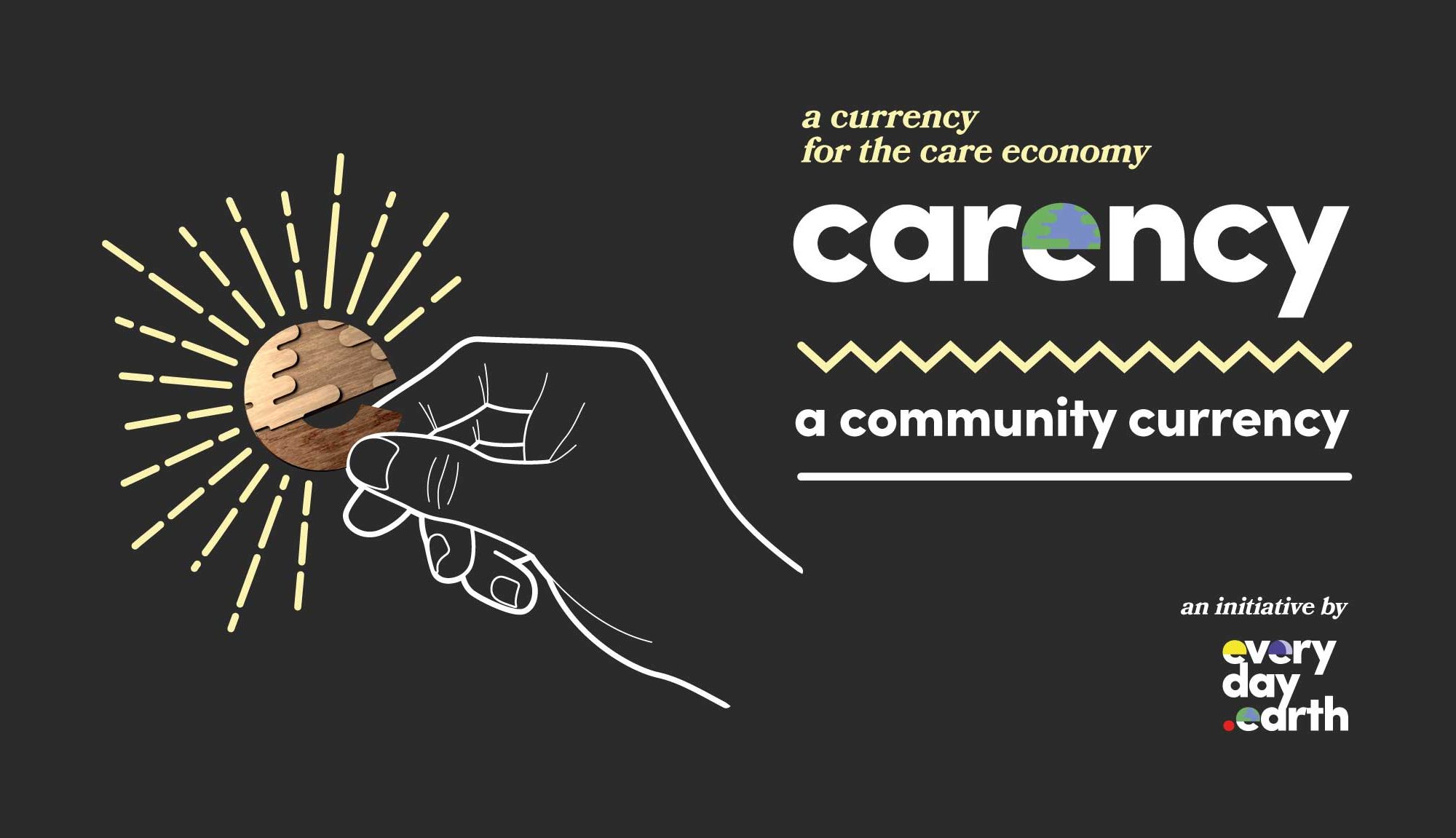
To create a better future, everyone felt motivated to turn their words into actions. The beautiful streets of Nice witnessed a sweeping change as people started a new trend called “plogging” – a combination of jogging and cleaning up litter. And this was just the beginning. Everyday Earth embraced the spirit of kindness with concepts like “pay-it-forward”, bringing relief to those in need, including the homeless. Additionally, Everyday Earth birthed a local currency, with the aim of injecting new life into the local economy.

More selected studio output continue the visual journey
Award-winning journalism

A short festival!

GSI CAPITAL - Do Better

Igirama by William Verstraeten
Flos Dieleman Advocaten
De Vleeshal - exhibition reports
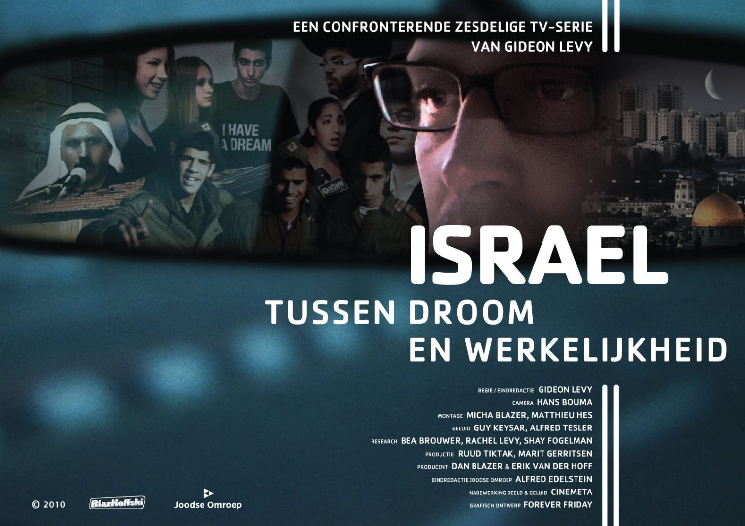
Israël - documentary series poster

Kleurentaal website
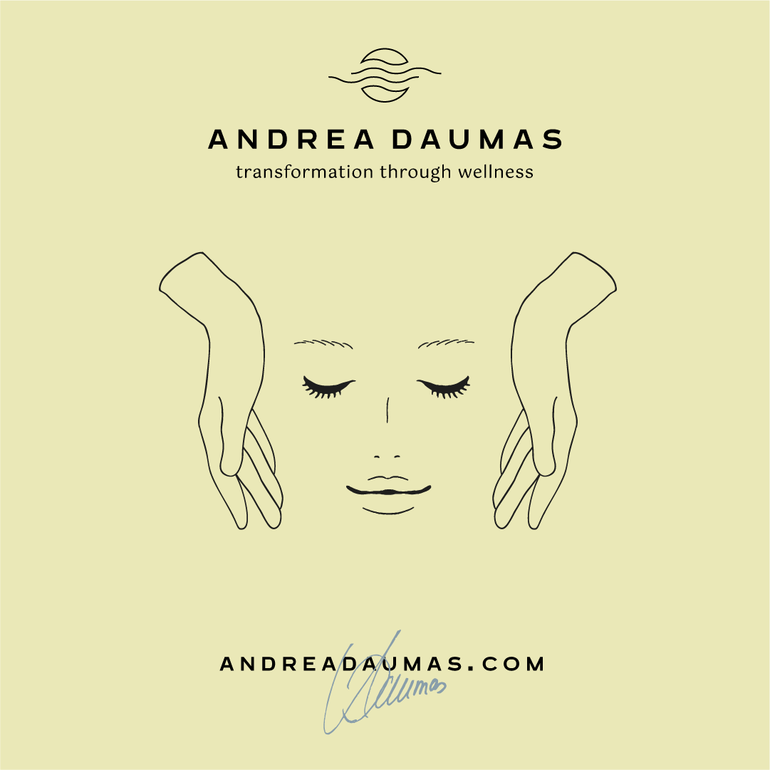
Andrea Daumas - visual identity

Selected logo work MM — MMXXIV

More projects will be added soon. #buildinpublic

Some of the great clients we worked for Via our own studio and external agencies

Frans Meulenberg, Erasmus Universiteit, VPRO, Joodse Omroep, Blazhoffski, Rijkswaterstaat, Zorgstroom, ING Group, autoRAI, Apple, De Architect, Gemeente Amsterdam, Levy Productions, Tempo Team, UNIT4, Elsevier Group and many others…
Nederlands

Sustainable Investments JGM CAPITAL, AMSTERDAM

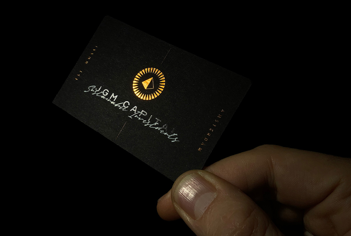
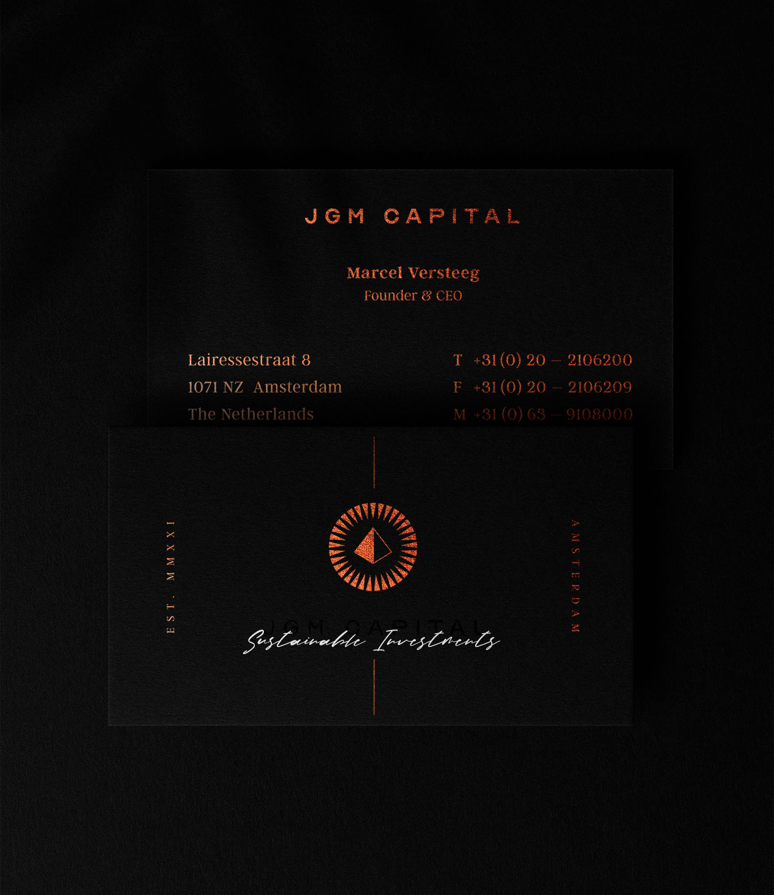
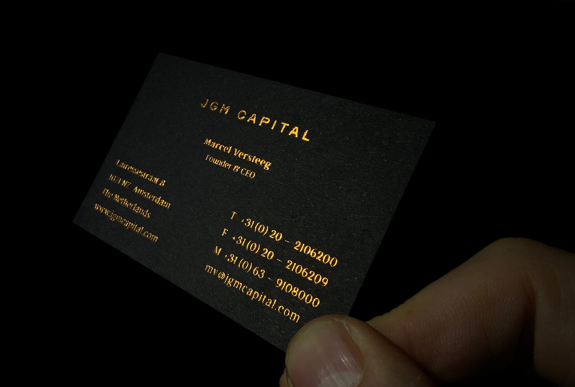
Hot foil stamped business cards. CO2 neutral production by Drukkerij De Bij, Amsterdam.

500 gsm Fuego Stone Coal Black paper stock. Black, white & copper foil stamping. No inks used.

Emblematic of JGM Capital, the logo artistry encompasses a radiant sun exhibiting 33 unique beams – an idiosyncratic detail per client’s request. This sun cradles a classic pyramid, an epitome of sustainability and durability, illustrating the profound essence of JGM’s wisely chosen investment avenues.

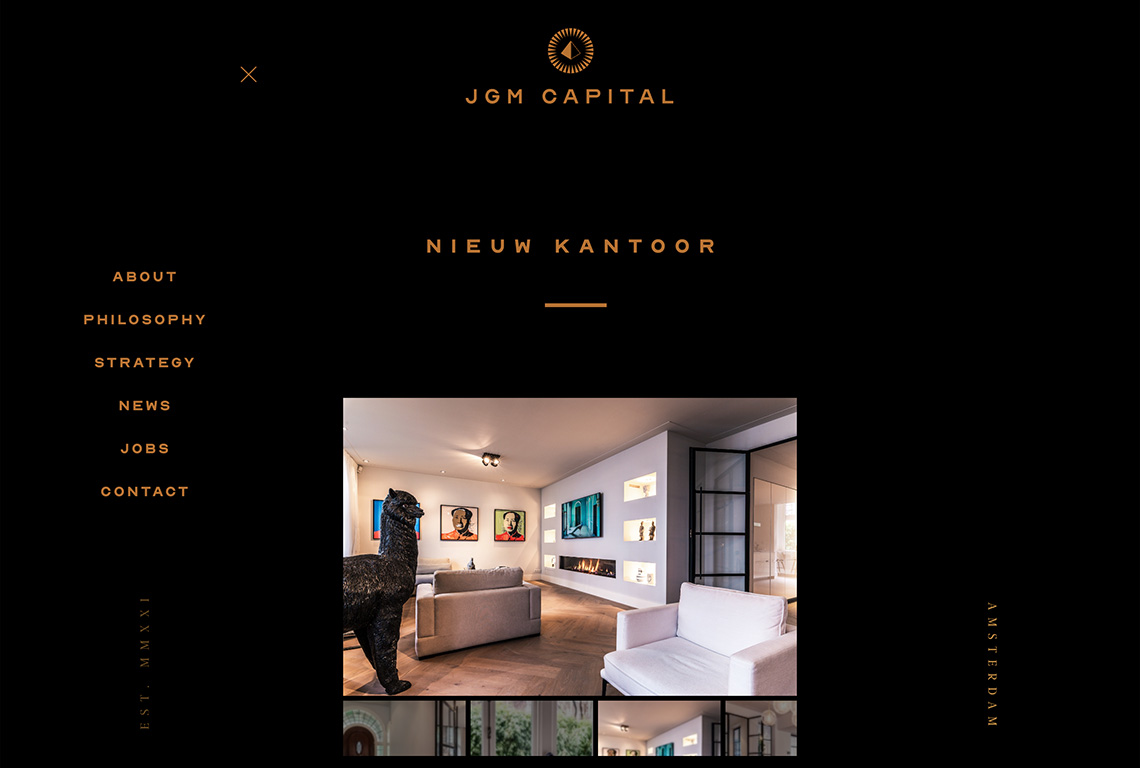
JGM Capital website responsive view: phone.

JGM Capital website responsive view: tablet.

Agirrr / Everyday Earth Cagnes / Nice, France

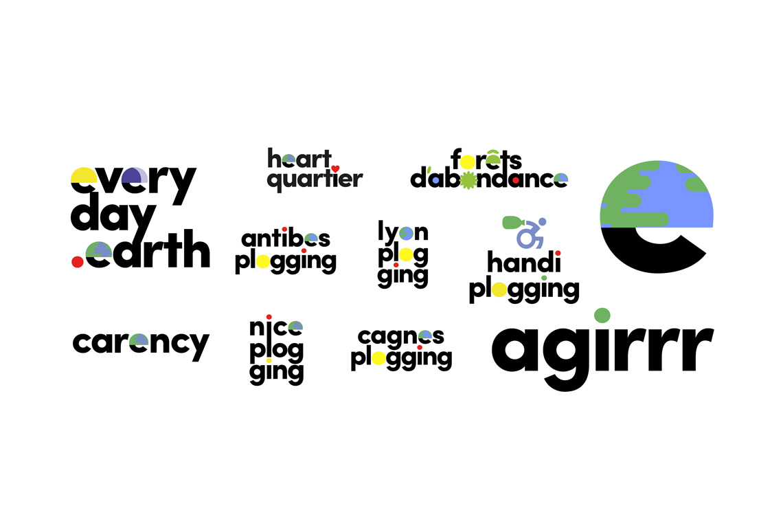
The vibrant imagery above showcases a selection of the distinguishing elements of Everyday Earth’s and Agirrr’s comprehensive visual identity system. Sculpted from whimsical typographic playfulness, underlined by a potent geometric essence, and dressed in colors too commanding to be overlooked, these elements imbue a striking visual language.

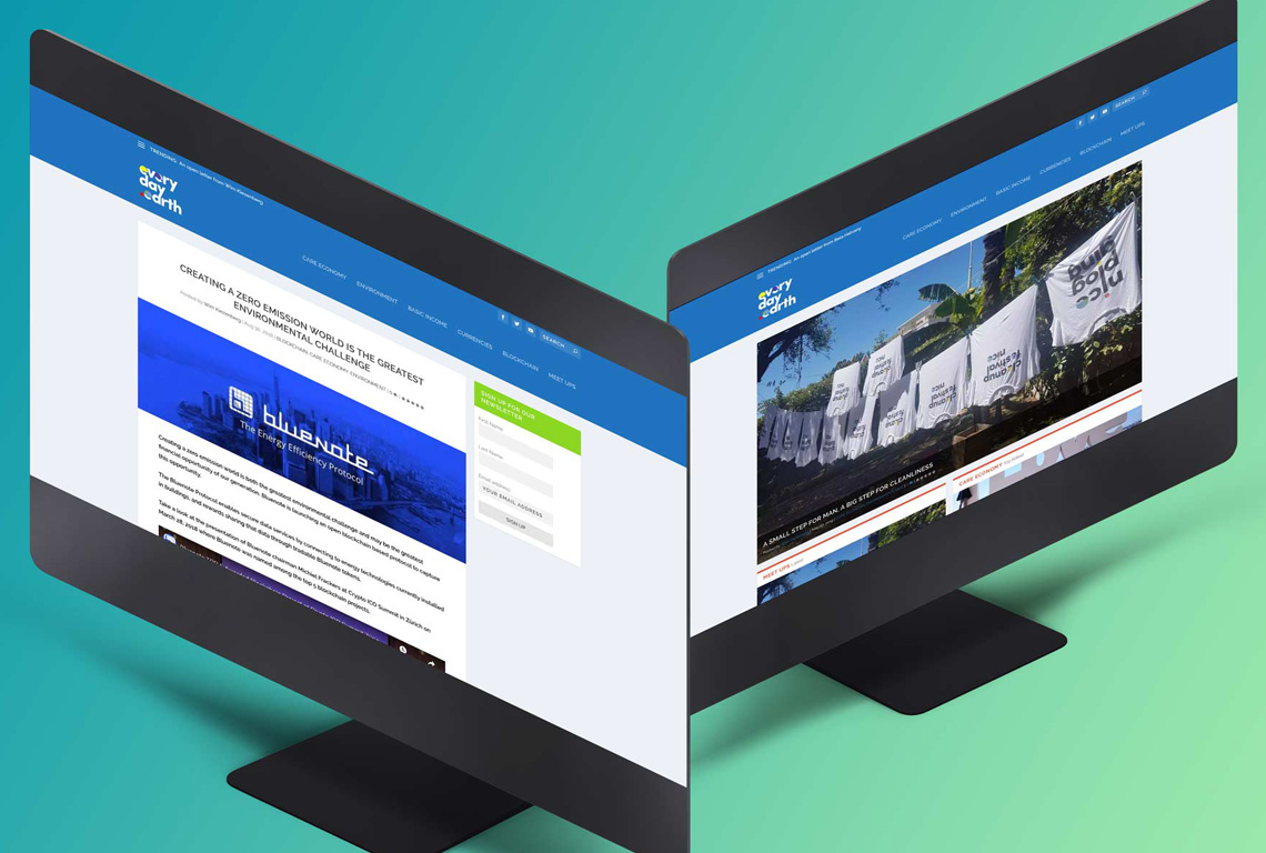
The everyday.earth domain hosted community-building resources, conversations, video interviews and more. Created in close collaboration with Mathieu Peroni.

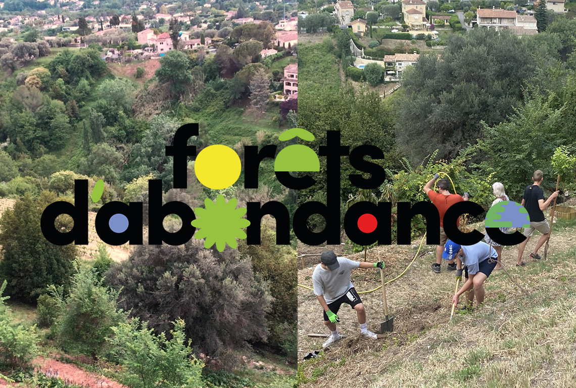
In the realm of creativity and visionary leadership, Diane Van den Berge’s intellectual prowess sparked life into Agirrr’s innovative project, Forêts d’Abondance. This initiative, as profound as it is inventive, seeks to sow the seeds of change on the verdant undulations encircling the picturesque hamlet of St. Paul de Vence. Its mission? To embolden the proliferation of trees and invigorate the vibrant weave of biological diversity. To bring this conception to life, Studio Waldbach deftly etched a logo, a symbol imbued with themes of positivity, plenitude, and multiplicity, mirroring the initiative’s core values.

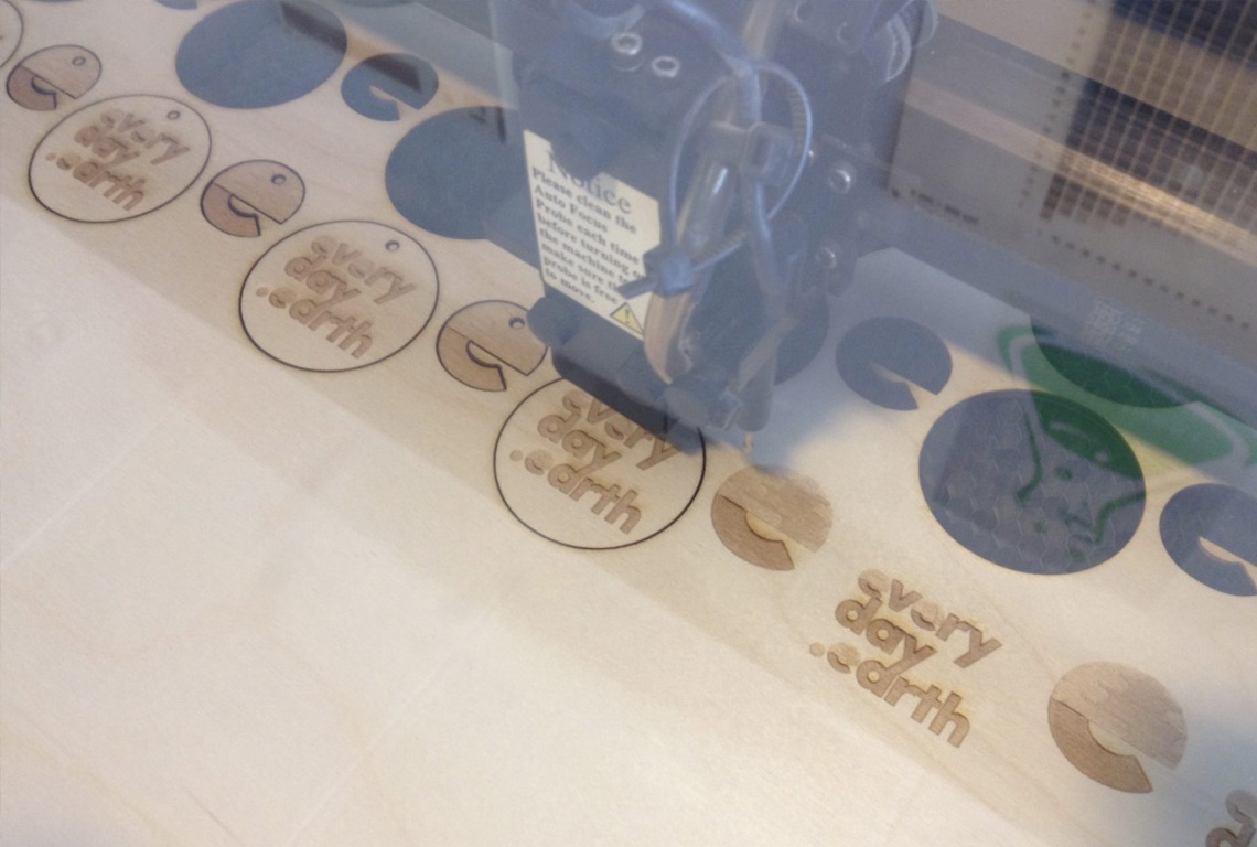
A highly sophisticated laser-cutting machine gracefully dances upon the creation stage, bringing to life the tokens of prosperity for the Everyday Earth’s collective. These emblems, baptized as Carency, would soon become the beating heart of their communal exchange.

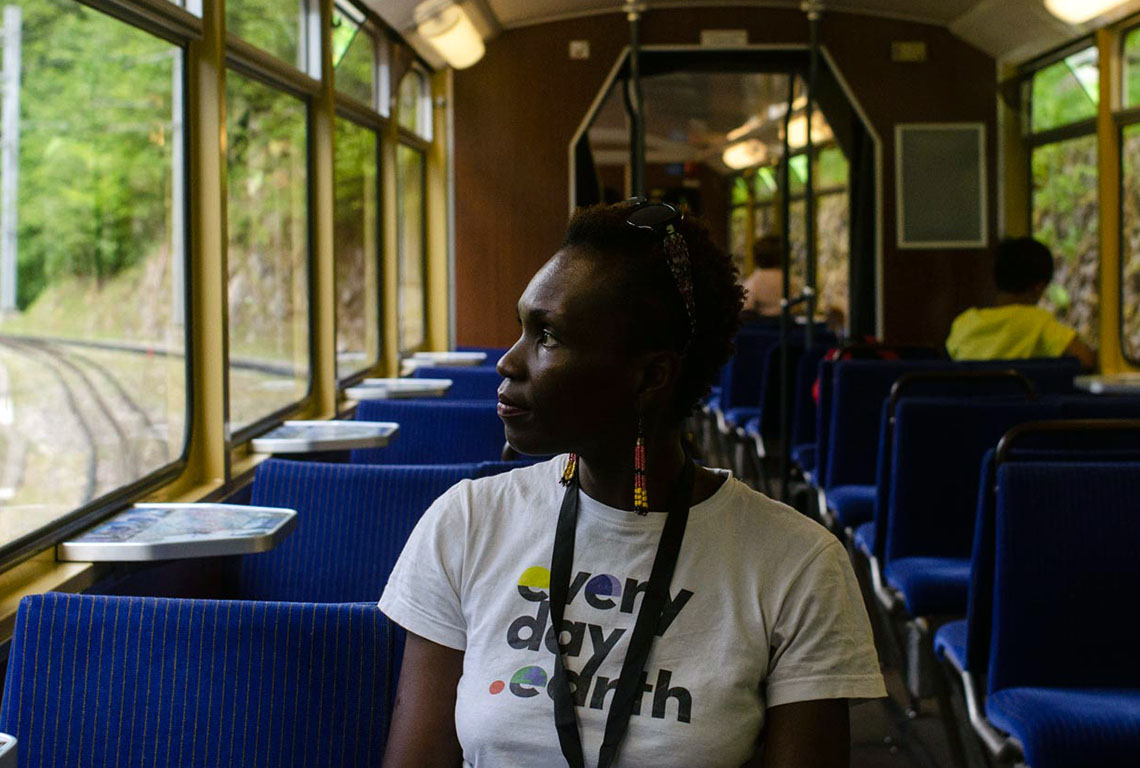
Enrobed in the fabric of an Everyday Earth tee, Barbara journeys through the scenic vistas en route to the much-anticipated summit of Care Economy in Caux, Switzerland.

The presence of Agirrr, once known as Everyday Earth, radiates from the luminous glow of media spotlights to the adrenaline-pumped arenas of sponsored sports teams while subtly whispering their brand story through the bustling veins of urban streets.

In the big, beautiful play of life, the team at Agirrr, earlier known as Everyday Earth, creates a harmony of unity for a special reason. They’re all about building a world where we all live in peace, giving back to Mother Nature and our communities. Agirrr adds color to our world with a diverse and ageless touch, saluting the beautiful blend of cultures and eras.

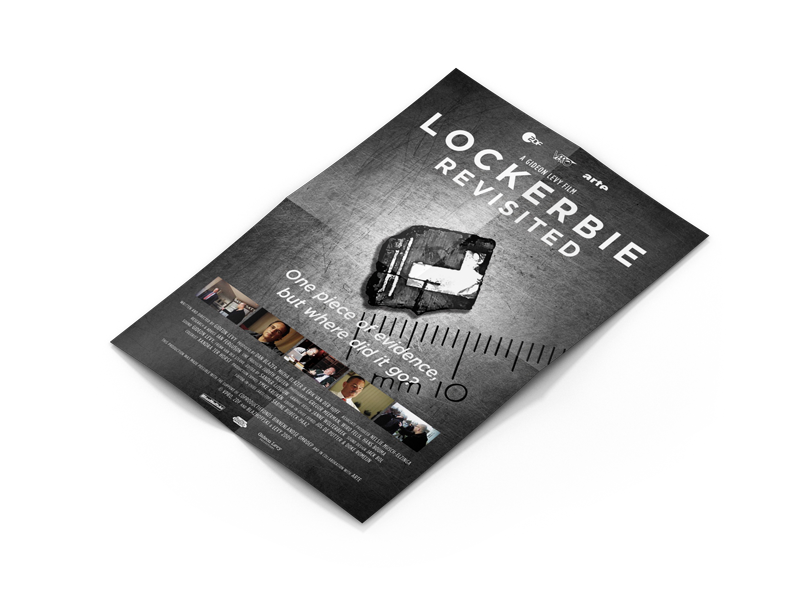
Lockerbie Revisited Award-winning documentary

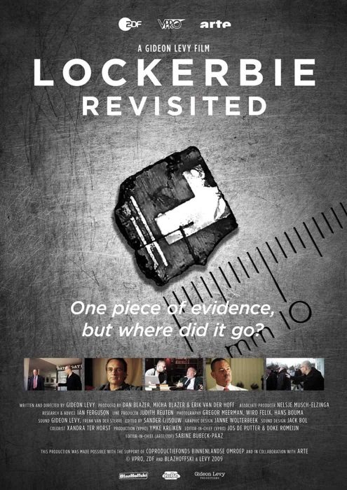
LockerbiePoster_web.jpg

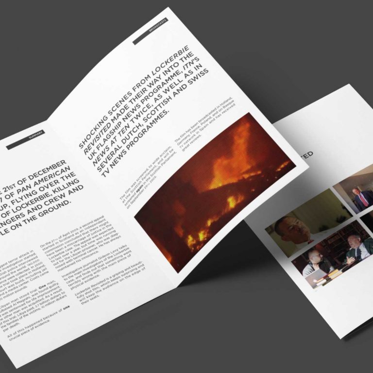
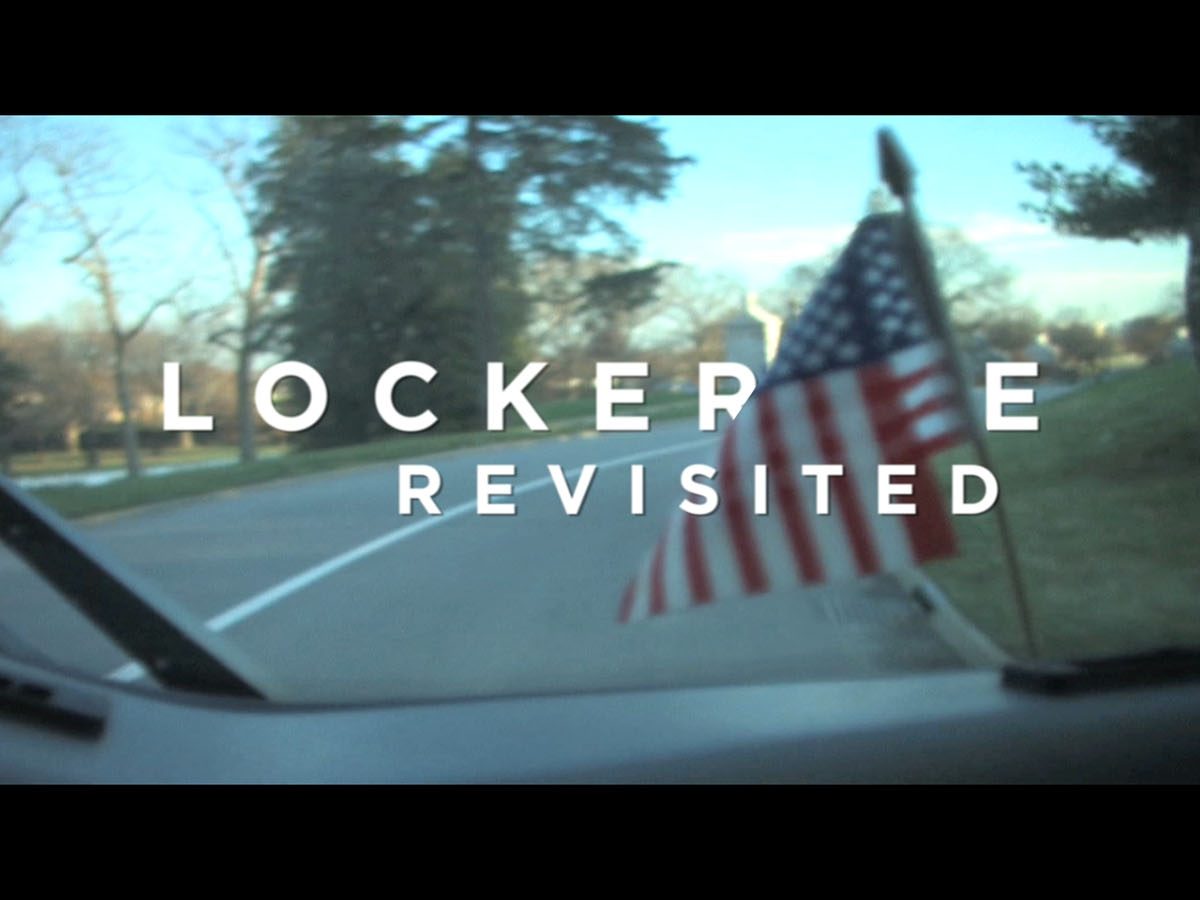
Design and animation for documentary Lockerbie Revisited.
Studio Waldbach expertly captured the essence of the story, effectively conveying the emotional depth and intensity of the subject matter. Our meticulous attention to detail and aligning to the story’s gravitas elevated the documentary’s visual impact, leaving a lasting impression on the audience and contributing to its award-winning success.

Gideon Levy’s acclaimed investigative documentary film, Lockerbie Revisited, delves into the infamous bombing of Flight 103 over Scotland. The film received widespread recognition and accolades, including winning the prestigious Prix Europa in Berlin in 2009. Additionally, it was honored as the ‘Gold World Winner’ at the New York Festival in 2011, further solidifying its impact. The documentary also garnered a nomination at Canada’s Banff World Media Festival in 2010 for the esteemed ‘Rockie Award for Investigative Journalism & Current Affairs’. Furthermore, Lockerbie Revisited was screened before the Scottish Parliament, highlighting its significance and relevance.

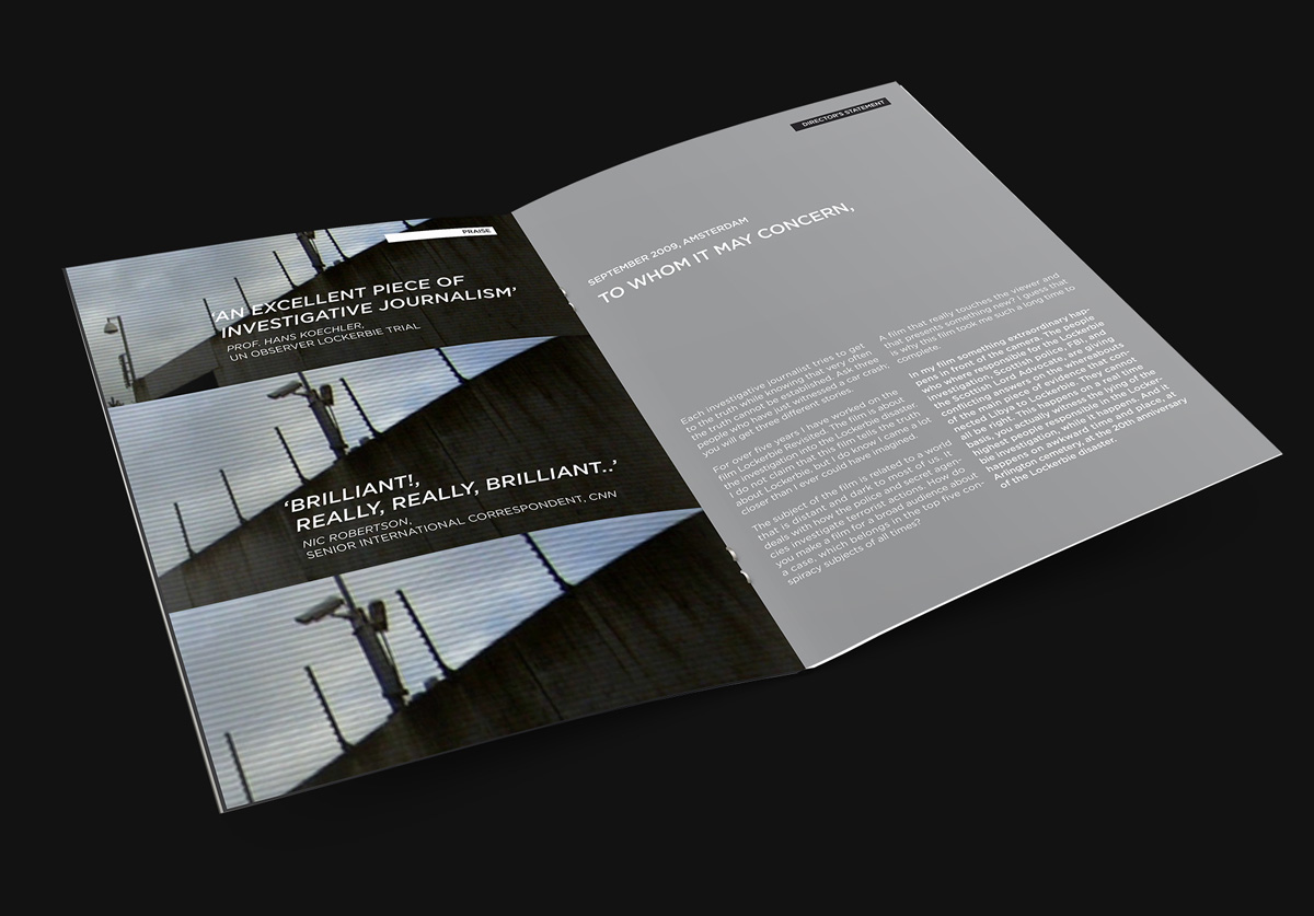
Studio Waldbach designed all promotional materials, including poster, official press release, and more. With consistent typographical treatment and emphasis on the documentary’s gravitas and the importance and credibility of the investigative journalistic effort.

Our studio was also responsible for designing and animating the opening title sequence.

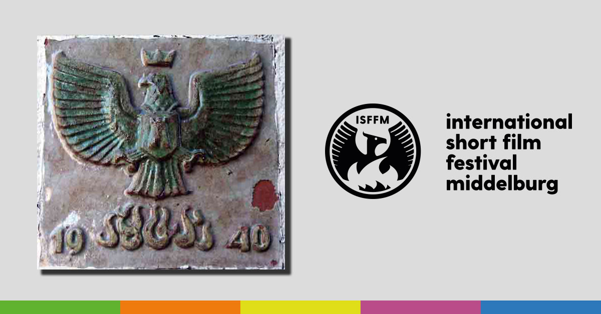
International Short Film Festival Middelburg

Cover of the programme booklet, designed by Studio Waldbach, along with the visual identity.

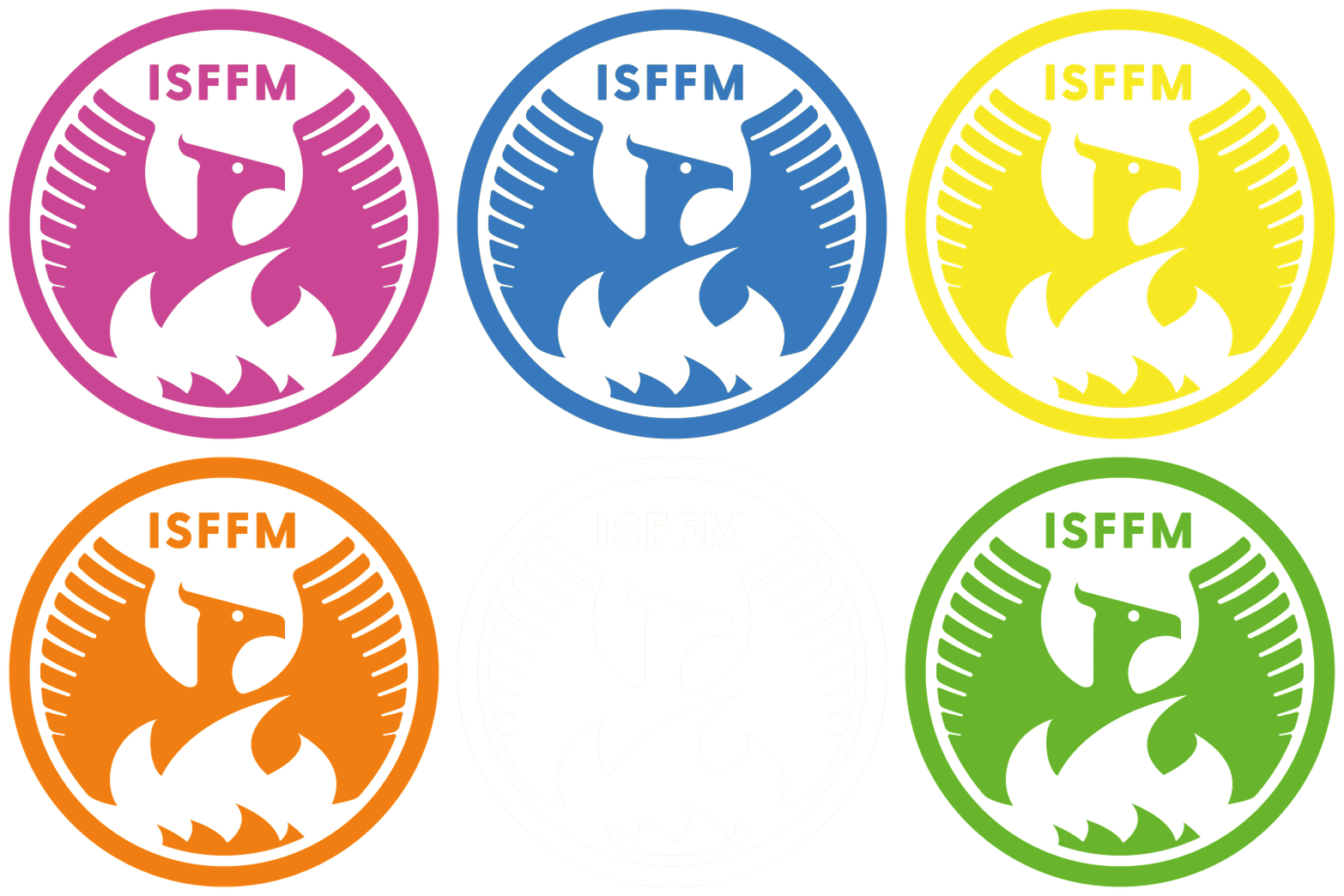
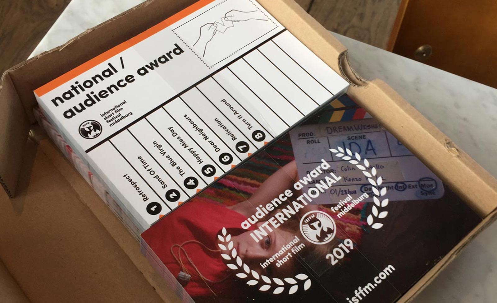
After the city went up in flames in World War II, the city of Middelburg was rebuilt, it had risen from the ashes like a Phoenix. The different award categories at the festival were marked by color codes.

Studio Waldbach designed the visual identity and took care of the implementation of all brand expressions across different static and moving media.

Each award category had an option for the audience to cast their vote.

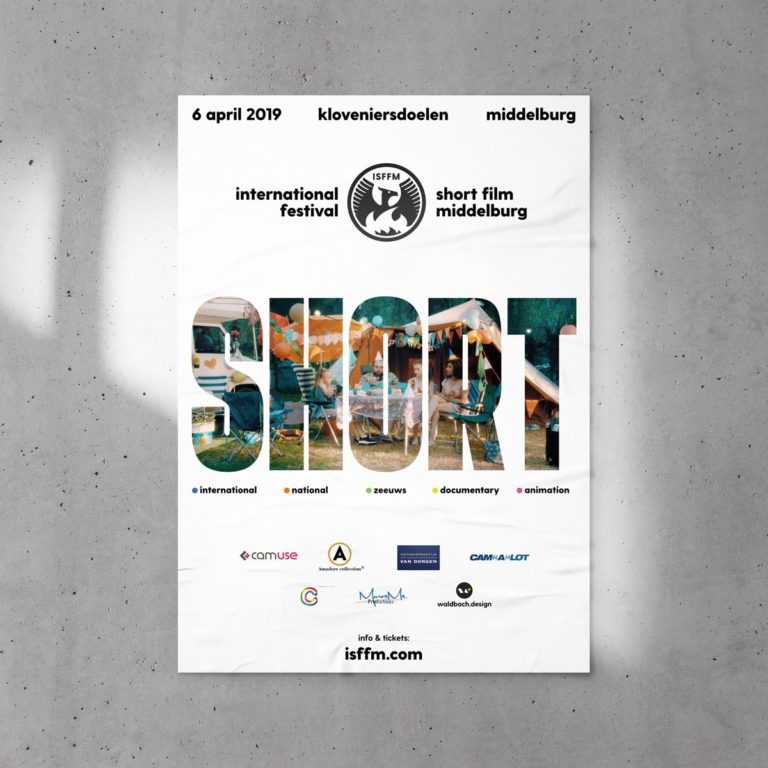
One of the poster designs.

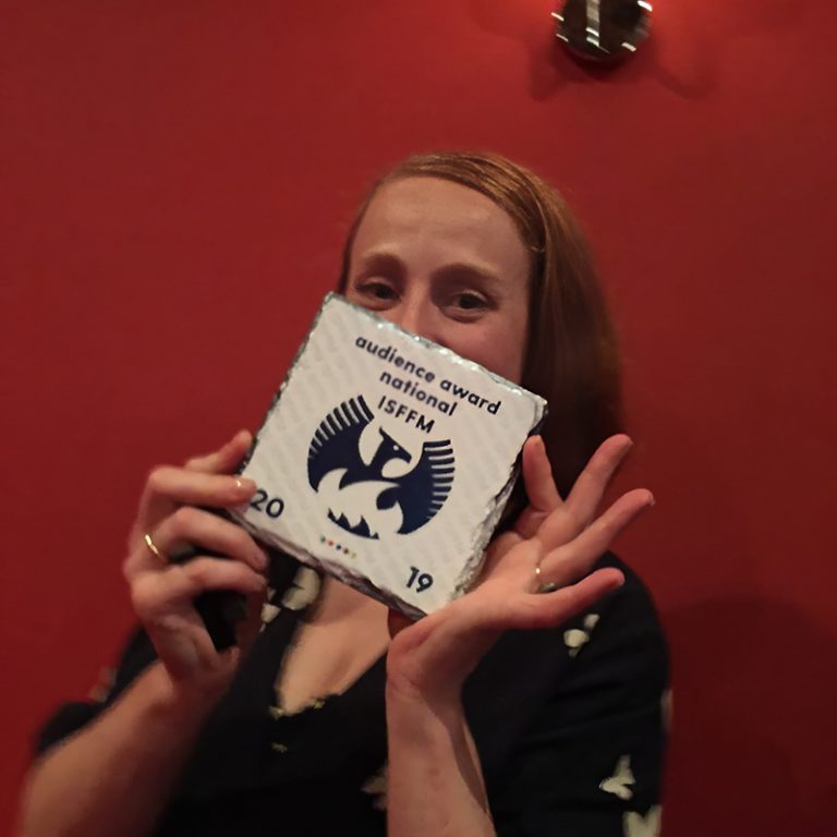
A proud actress showing her award tile, for the category ‘National’.

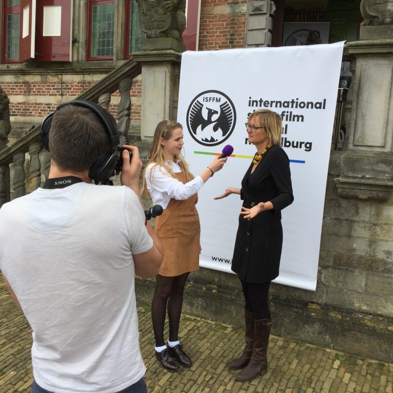
Local media attention at the entrance of the impressive, historic location in the heart of Middelburg.

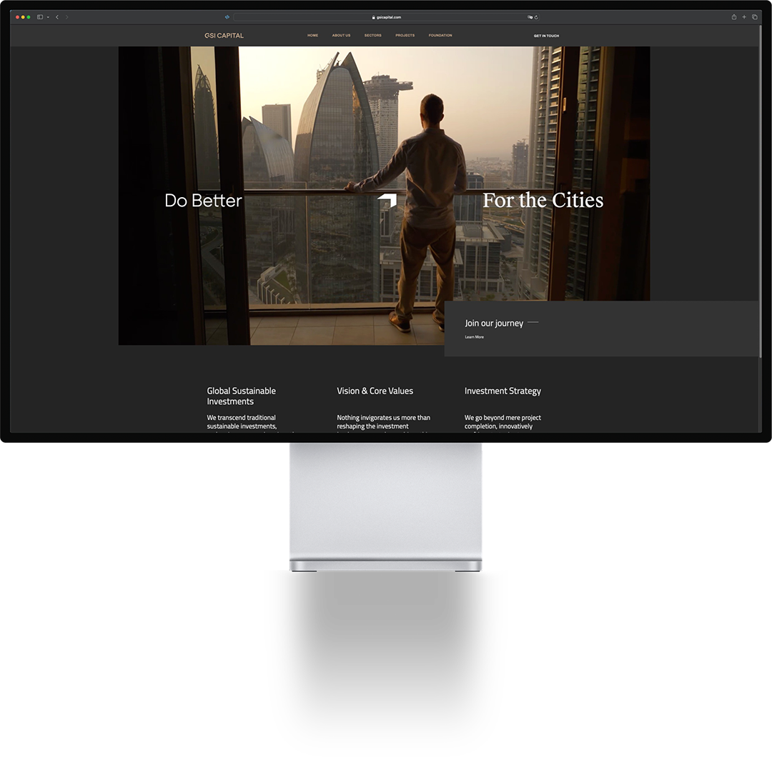
GSI CAPITAL Web Experience

The Igirama Projects William Verstraeten

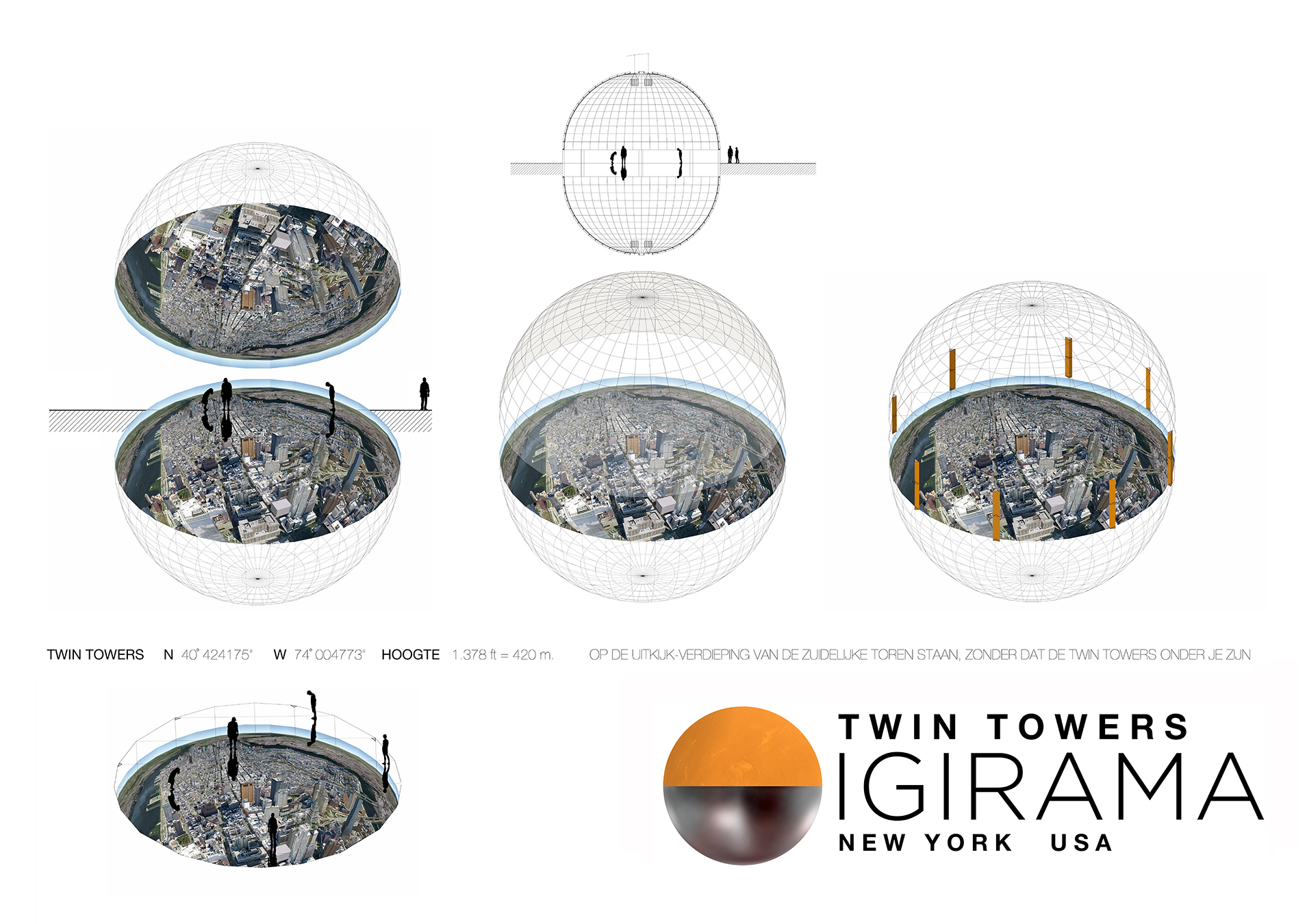
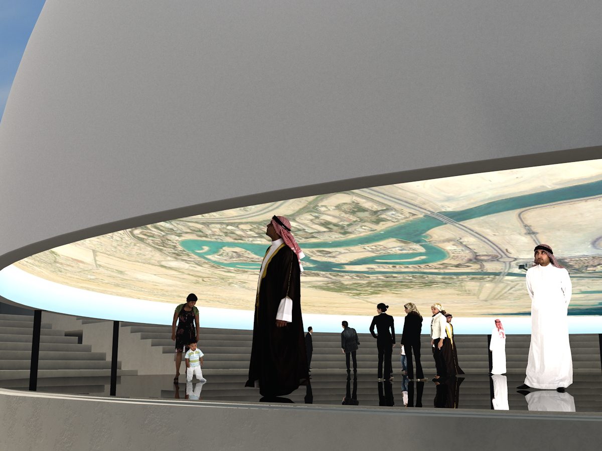
Studio Waldbach assisted with several ambitious projects by the late Dutch artist William Verstraeten. One of them was the Igirama project: Igirama, as coined by William, is a spherical panorama, with an equirectangular image printed on the inside of a hemisphere, about 12 to 30 meters in diameter, reflected on a giant disc-shaped mirror on the floor. It gives the visitor who enters the Igirama a sense of walking in the sky.

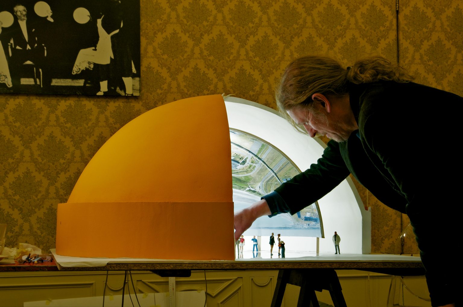
Artist William Verstraeten at work with a miniature prototype Igirama. This one for a location close to the nuclear power facility in Zeeland, The Netherlands. Other proposed locations for a bespoke Igirama installation were the WTC Memorial Museum in New York City, Doha in Qatar, Hiroshima, and others.

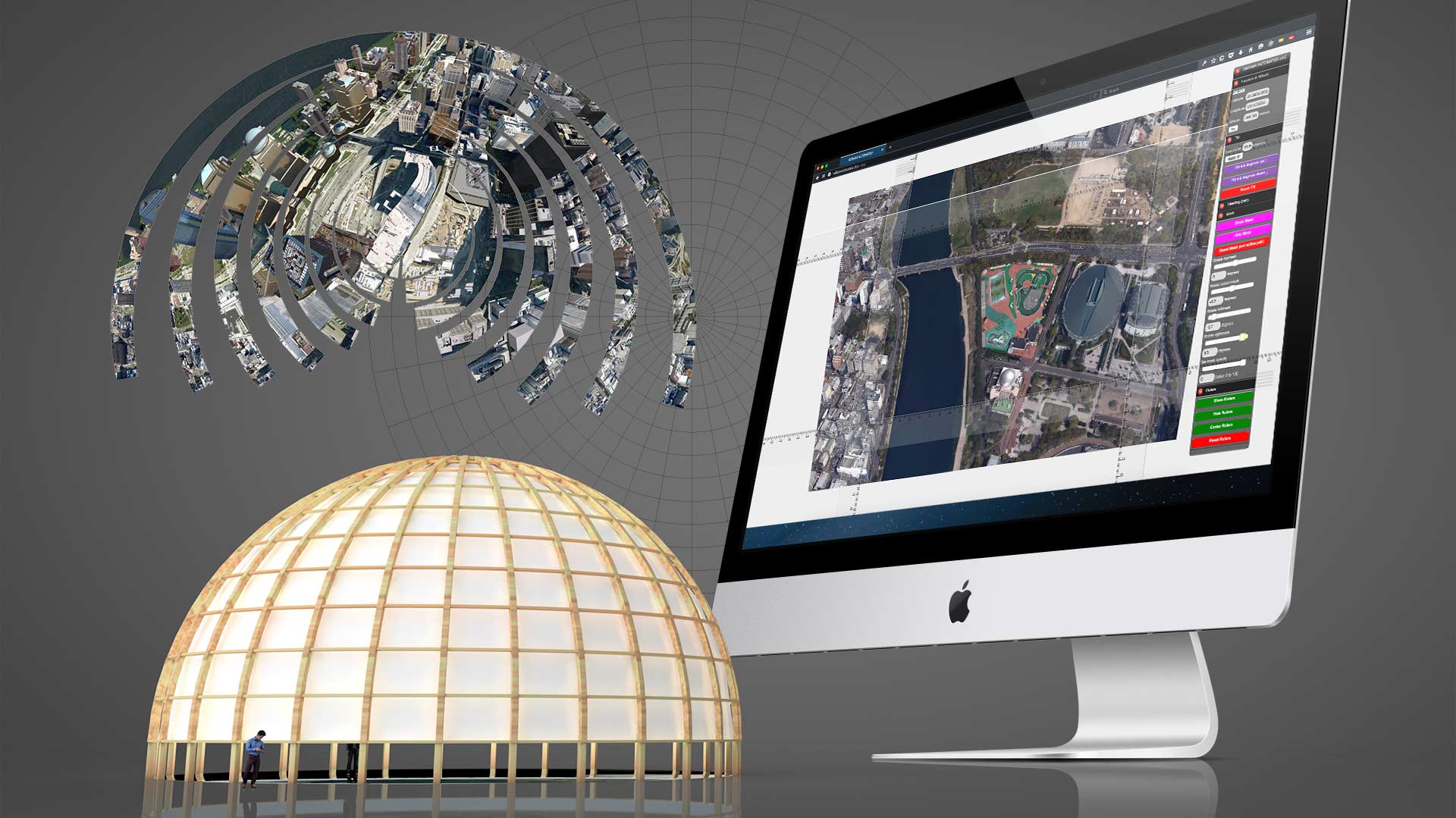
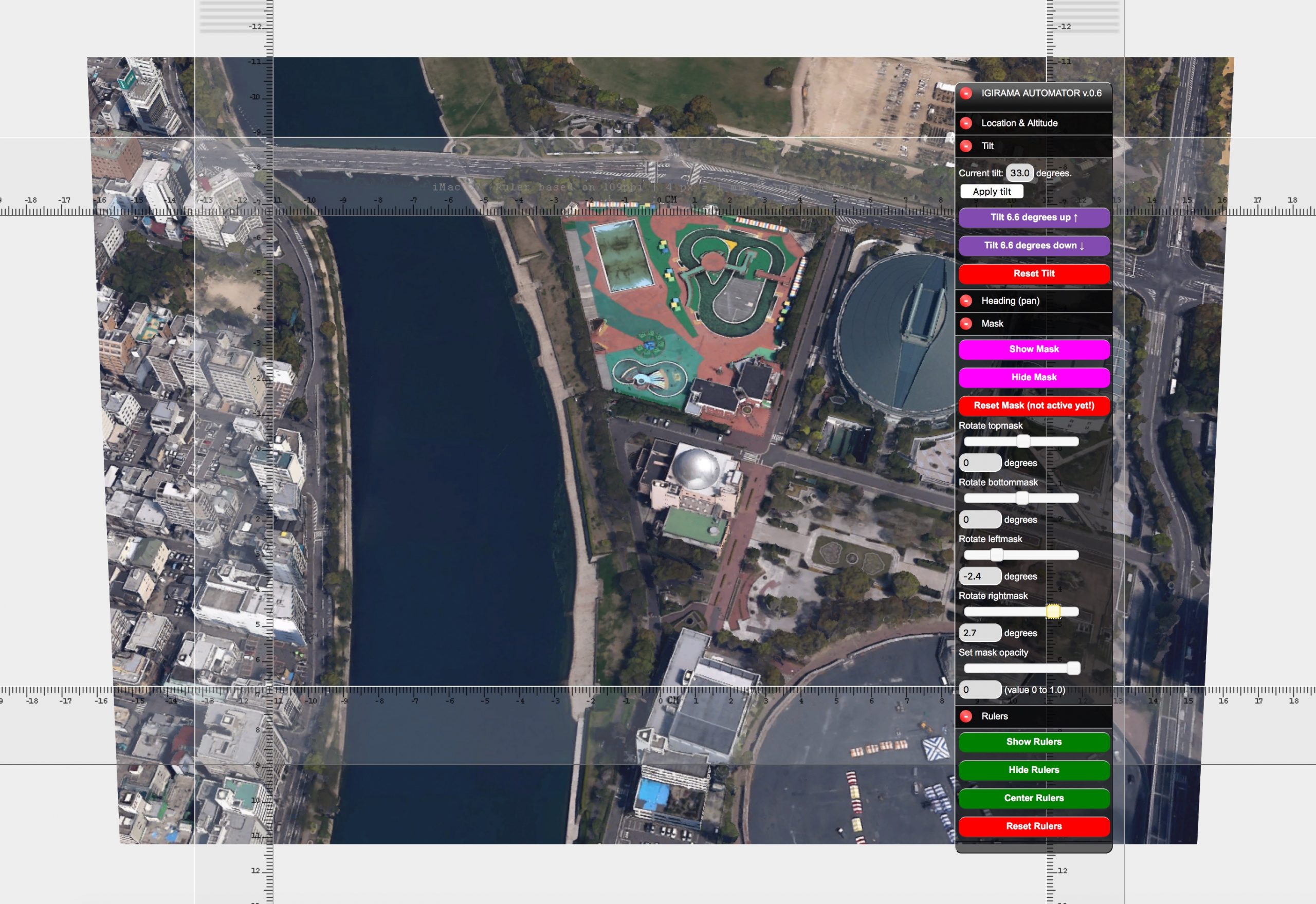
Studio Waldbach programmed a web application based on the Google Earth API, to help measure and produce the curved strokes that were to be used inside an Igirama maquette.

The interface of the Igirama Automator, as the web app was baptized. With a floating, collapsible instrument panel, any view of any location could precisely be measured. It also included rulers that could be moved and rotated with high precision.

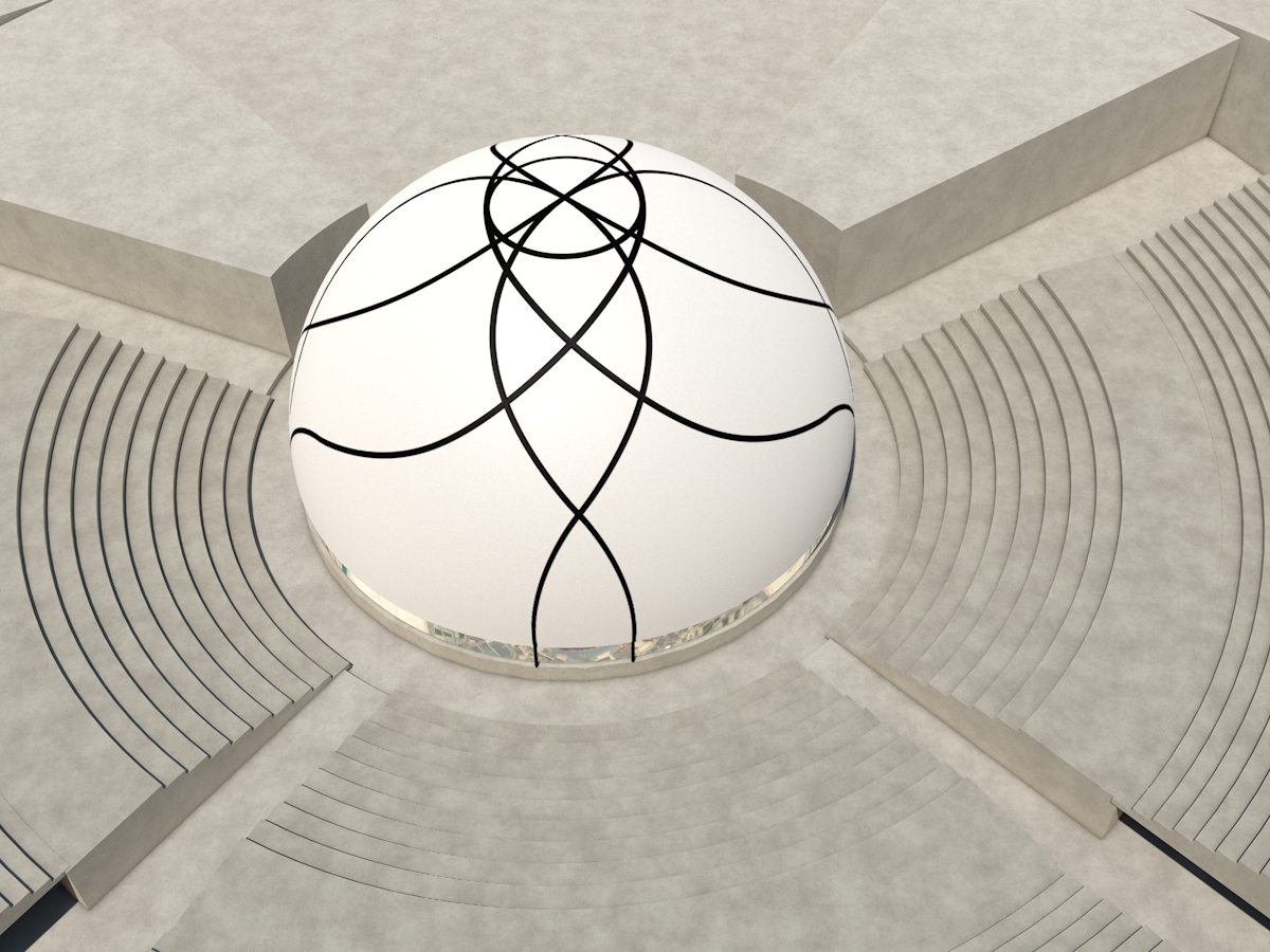
A bird’s eye view render that Studio Waldbach produced for presentation in Doha, Qatar.

Another render of the Doha Igirama.

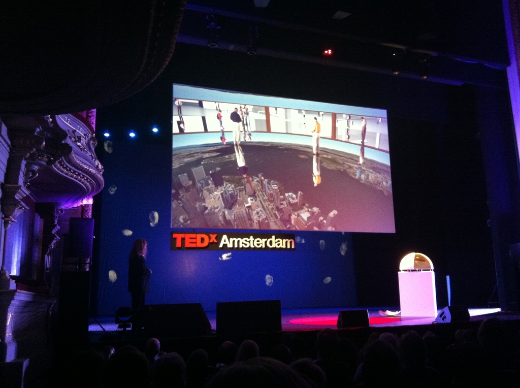
The projects garnered a lot of global media attention. The Twin Towers Igirama was also presented on TEDx Amsterdam.

Studio Waldbach contributed to the realization of this video presentation, which also serves as an explainer video. This one was produced specifically for the New York Twin Towers Igirama.

Skip to content